
 IMAGE ONE: This is the completed poster for my album cover advertisement.
IMAGE TWO: This image I made by taking two images that I had taken at music gigs I have been too and changed the opacity of the two and merged them together. I then changed the Threshold of one of the images to give the stencil effect on the image. I then rubbed out part of the bottom layer to create that large white patch at the top as the two layers didn't connect correctly I made them work together. I wanted to use this as a large part of the poster to connote a large fan base of the album and band and I feel the stencil look of the picture is quite a modern art look which would connote youth. IMAGE THREE: This is me starting to construct the advertisement. IMAGE FOUR: I have used a corrugated iron Photoshop Brush on the top half of the advertisement to bring it together as i didn't want any white space. I then added some more iron brush for the album to sit on.


IMAGE FIVE: I added the front album cover to the advertisement which fits nicely onto the corrugated iron brush on the page.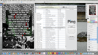 IMAGE SIX: I added small advertisements to the page which would be seen on advertisements of this style in magazines. I researched into record companies and selected two which would suit the style of the band i have used. i choice Roadrunner Records and Silverline Records who have both signed bands of a similar genre and are widely acclaimed over both America and the UK.

 IMAGE SIX: I added small advertisements to the page which would be seen on advertisements of this style in magazines. I researched into record companies and selected two which would suit the style of the band i have used. i choice Roadrunner Records and Silverline Records who have both signed bands of a similar genre and are widely acclaimed over both America and the UK.

IMAGE SEVEN: I then added the text to the album which is the same as the album cover. I used red to stand out against the back and white and to make the red on the album cover to pop and stand out more. I also added that it was a 'Deluxe Album' to make the album sound exclusive and of limited availability. I then added the name of the band and that date of its release.
No comments:
Post a Comment