Monday, 2 May 2011
Sunday, 24 April 2011


Monday, 18 April 2011
Thursday, 14 April 2011
filming:editting and explanations


As you can see I was using the editing software Final Cut to make my video. I have used Final Cut before on other media projects which I found very useful to have previous experience of such an extensive program. I experimented with different transitions through-out the video to achieve the desired effect of pulsing black background which worked well and connoted a heart beat and fear which linked in with the use of Death and tarot cards. I used overlays frequently to merge the live performance with the storyline as I didn't want them to look like two completely different devises. I had a large amount of shots to choose from to use which was good as I wasn't reliant of a few select shots from from this point of view I was very happy with my previous filming. I found it difficult in places trying to balance the shots to follow the music but I was determined for the shots to fit perfectly with the music which I feel that they do.
knowledge of shots and angles


I have use a varied amount of shots in my music video from point of view shots to extreme close ups. i used a varied amount of shots to make it more enjoyable to view and to 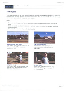 follow the conventions of rock music videos which I have previously analysed. I shall be also using overlays and transitions between the shots to excite the viewer more and make it interesting. I want to follow the conventions of rock music videos but also to put my own creative mark onto it because if I was making this for a large band and the video were to be shown to a wide audience a generic video wouldn't grab the viewers so I will try to add my own essence to the video editing. All of the shots i have shot from a landscape angle as this is necessary for a music video. I have had to shot one shot from a portrait angle as I couldn't hold the camera in a landscape way so i shall rotate the shot in editing. i am looking forward to seeing the finished product.
 follow the conventions of rock music videos which I have previously analysed. I shall be also using overlays and transitions between the shots to excite the viewer more and make it interesting. I want to follow the conventions of rock music videos but also to put my own creative mark onto it because if I was making this for a large band and the video were to be shown to a wide audience a generic video wouldn't grab the viewers so I will try to add my own essence to the video editing. All of the shots i have shot from a landscape angle as this is necessary for a music video. I have had to shot one shot from a portrait angle as I couldn't hold the camera in a landscape way so i shall rotate the shot in editing. i am looking forward to seeing the finished product.
poster advertisment

 IMAGE ONE: This is the completed poster for my album cover advertisement.
IMAGE TWO: This image I made by taking two images that I had taken at music gigs I have been too and changed the opacity of the two and merged them together. I then changed the Threshold of one of the images to give the stencil effect on the image. I then rubbed out part of the bottom layer to create that large white patch at the top as the two layers didn't connect correctly I made them work together. I wanted to use this as a large part of the poster to connote a large fan base of the album and band and I feel the stencil look of the picture is quite a modern art look which would connote youth. IMAGE THREE: This is me starting to construct the advertisement. IMAGE FOUR: I have used a corrugated iron Photoshop Brush on the top half of the advertisement to bring it together as i didn't want any white space. I then added some more iron brush for the album to sit on.


IMAGE FIVE: I added the front album cover to the advertisement which fits nicely onto the corrugated iron brush on the page.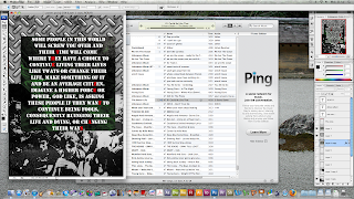 IMAGE SIX: I added small advertisements to the page which would be seen on advertisements of this style in magazines. I researched into record companies and selected two which would suit the style of the band i have used. i choice Roadrunner Records and Silverline Records who have both signed bands of a similar genre and are widely acclaimed over both America and the UK.

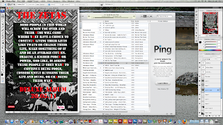
 IMAGE SIX: I added small advertisements to the page which would be seen on advertisements of this style in magazines. I researched into record companies and selected two which would suit the style of the band i have used. i choice Roadrunner Records and Silverline Records who have both signed bands of a similar genre and are widely acclaimed over both America and the UK.

IMAGE SEVEN: I then added the text to the album which is the same as the album cover. I used red to stand out against the back and white and to make the red on the album cover to pop and stand out more. I also added that it was a 'Deluxe Album' to make the album sound exclusive and of limited availability. I then added the name of the band and that date of its release.
inside and outside of album cover


IMAGE THREE: This is the final piece for my inside insert for my album cover where the CD would sit. I followed the conventions of album covers and made some artistic work to sit inside the front cover. I made this by selecting some light trails which I had photographed on a long shutter speed at night to produce these long trails of light. I then used overlay and change of opacity on that layer to make it look like it does now. I also added more green lightning brushes over the top. For the CD I used the circular marque tool to make the size of the shape I wanted and then selected the same tool but inversed it to delete the centre circle. I then added the text to it which was the same text that I used on the front cover of the album cover to tie it together. I then adjusted the settings for the shape I had made to create an outer glow and shadow which made the outer white edges to my shape. IMAGE FOUR: This was my first attempt at an inside insert to my CD cover. As you can see the CD side of the cover stayed the same but the CD listing of the songs has been moved to the outside of the cover which follows the conventions correctly. I feel that the inside cover i made looks cleaner and crisper than the writing on the inside. IMAGE FIVE: I used the same kid of back ground for the back cover. I used the part of the background I created with the least amount of green brushes on it and cropped it to create my back page. I then used a picture of a fire which low opacity at add texture to the piece and added a picture of a holy bush to add more texture and to add in a little bit of green to tie it all together (pictures see above IMAGE ONE AND TWO). I scanned in an album cover to get the authentic additions to the album cover
which are both next to the bar code. I feel this helps me see what it would look like if it were to be printed for an artist release. The album cover is set at an angle as I wasn't able to scan it in at this angle its not set correctly. The bar code is supposed to be situated at the bottom right-hand corner with the song listings reading down the back. I decided to do this to follow conventions that song listings are normally listed in an exciting fashion. I feel this adds to the feel of it being an authentic album cover.


Front of the album cover


IMAGE ONE: This is the final album cover, although it went through many changes in the process of it being made which i shall document. I'm very happy with the finished result for feedback i shall be showing the band who's music I have used for the music video. I feel like the swearing on the front cover would make it controversial because if this were to be commissioned for printing it would gain recognition as did the sex pistols album cover 'Blame it on the Bollocks' for its outward language. IMAGE TWO: This is the background I used for the basis of my front cover. I like the grungy distressed look of the image and i think that i may use this across the different components of my album cover to tie it all together. I made this by using varied Photoshop brushes from brusheezy.com and using an eraser tool and changing the opacity of the tool to make a gradual change between the different colours and brushes. IMAGE THREE: I put background into place and cropped it to the correct dimensions that I needed for an album cover. I an army style font for the writing on the front cover to connote power and conformity which is juxtaposed again the message in the writing. I just had to find a way to add the band name to front cover without imposing on the front cover itself, but still giving the band name enough definition to stand out. I finally decided on highlighting certain letters in a red colour to spell out 'The Zetas' band name. I think it worked successfully as the front cover is quite different but still follows conventions I believe it to be quite intriguing and would make people inquisitive to view it. IMAGE FOUR: This is the album that I chose to create into a album cover as I felt it was the strongest out of the mock up album covers I have experimented with previously.


Thursday, 31 March 2011
Test Album covers


I tried to experiment with the trainspotting theme by using a text written by the lead singer of the band and adjusted by me. I asked him to explain the meaning behind the lyrics of the song i am using in my music video 'Off Peace'. The use of expletives would make this album cover more hard hitting if it were to be produced for retail. Again, if this album was going to be retailed I believe that an accurate record company to sign this band would be Roadrunner Records as they have signed such bands as Kids In Glasshouses and Madina lake who would fit the same flexible indie genre that the band I'm using 'The Zetas' would fit into. I feel that the style of the albums I have created haven't got the flair that would be expected from an album cover from such a competitive genre of indie. I shall be working on these harder as I like the written script on the front cover as I feel it would draw people in as they would be intrigued to know what it says. I also have to figure out how I would display the band name in an interesting way as I don't want it to infringe on the structure but it still has to display its importance. As you can see with these test albums (which unfortunately were printed on a black and white printer) I tried to emboss the lettering by duplicating the layer and changing the opacity of the white letter to create a slight shadow. This worked better with some rather than others as I experimented with he percentage of opacity to see how it behaved against the full white lettering in front. The band name was important for me to include so on the fourth album cover I tried to erase the embossed letters to show the letters of the band. this is difficult to see Becca's of the print out. I also tried to colour the letter which depicted the band name in the colour red. I felt red connoted danger and passion but also sophistication which I think would have suited such a young band. I like the look of the lettering in the centre as I think it is more eye catching, I also like the connections with the trainspotting monologue as it shows sophistication from the aspect of the band as trainspotting wasn't from their era as the film was released in 1996 and the band are all 16 years old. I shall experiment with this as extra colour, as I want the album to be different but still conforming to the connotations of rock and indie album covers.
album covers flat plans


I have decided on using the typed trainspotting inspired monologue. I feel that this would be apt it is inspired by 'Trainspotting' and would link in my media and collective identity within youth. I thought the other flat plan was too simple and had to reason behind it or rather had nothing to enforce the feeling of youth and the connotations that would bring.
album covers

I will have to create my album cover before my advertisement as i would need to advertise the album. I have reached a stumbling block as far as my second section of filming is concerned as i am finding it difficult to get studio time with the lighting after college hours so I am going to re-think the way it is going to be filmed and maybe use a photographic studio instead. While I have some time away from filming i decided to create a album cover. I have prior experience of Photoshop and photoshoots as I study photography and have a passion for it so I have a wealth of images I can use to layer and make designs with. I like the thought of doing a grungy album cover as this would suit the albums I initially analysed at the start of the course and i feel it would suit their indie sound. I have created a album cover before and I feel it worked really well so I would like to take inspiration from this. I shall start creating a range of flat plans to collect lots of inspiration.
Wednesday, 30 March 2011
First day of filming


This was the space I had to film the first section of my music video. The band were setting up an event to preform in the evening so I helped them out and also filmed my music video within the space of time between setting up the stage and waiting for the audience to arrive. It really was amazing to have the lighting, stage and equipment there for me to film with which I feel gives it an authentic feel. It was also quite a large stage which I could easily move around and get a selection of shots from. I shall be uploading a shot types sheet to show my understanding of shot types i shall be using in my video. I also was the band photographer for the gig which was not only great for my portfolio but i also have i got a wealth of photographs of the band which i could use during my construction of my poster and CD cover. I shall be deciding on flat plans very soon as i most importantly want them to relate back to youth culture. I feel like the filming went really well and the lighting was a brilliant addition to the filming. I got some great close up's with all members of the band, some footage I could use as cut-in's. It was really rewarding to experiment with different shot types as it gave me more than one way to look at a simple object and could make it very exciting if I was to select the correct one to compliment it.
Survey Monkey


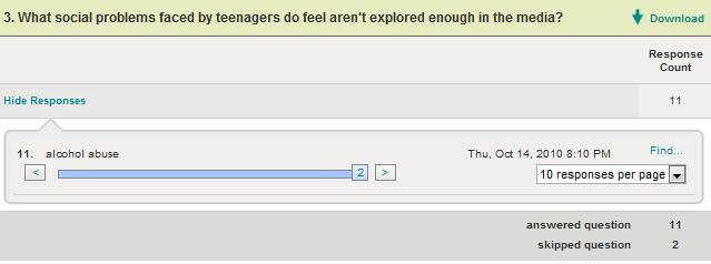


This is survey I made so that I would attract the correct target market for my music video. I wanted to understand what people take from the media and who they think about feel about it so I could correctly adjust my work to suit my findings. I was interested by my results as i was surprised that many teenagers wanted more coverage of teenage issues to be shown through my video. I feel like this would have been a deep and emotional topic to cover if I had longer to do so and had to resources to create such a piece i would have opted for an emotional storyline.
Questions one to eight, some of the questions are broken up due to the amount of responces i wasnt able to fit the results onto one screen shot.
Tuesday, 25 January 2011


Subscribe to:
Comments (Atom)